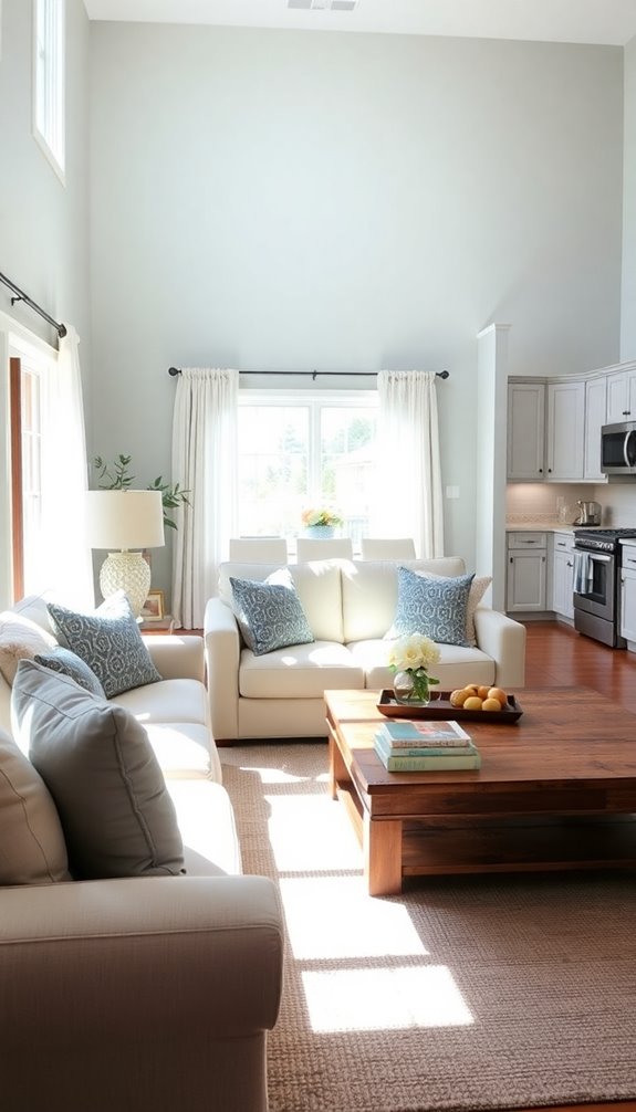
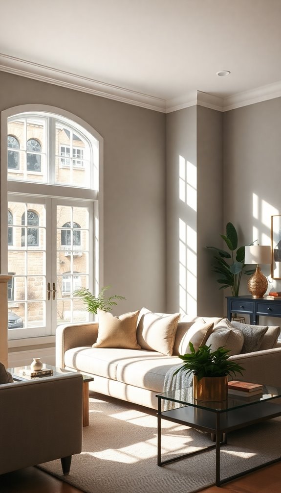
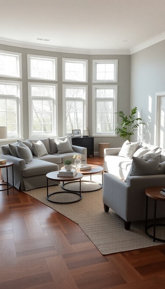
To create a cohesive Edgecomb Gray color scheme for your whole house, start with Edgecomb Gray as your main color. Use it for about 60% of your space to guarantee a unifying backdrop. Choose complementary shades, like Shadow or Tear Drop Blue, for secondary colors, making up 30% of your palette. Reserve 10% for bold accent colors that share undertones with Edgecomb Gray. Test these colors in different lighting to see how they interact. By maintaining this balance, you'll achieve a harmonious look throughout your home. There's much more to explore about enhancing your space further.
Overview of Edgecomb Gray
Edgecomb Gray, a popular greige paint color by Benjamin Moore, stands out for its warm gray and beige tones, making it a versatile choice for your home. This stunning shade features undertones of beige, yellow, and green, which can shift in appearance based on your surrounding colors and lighting conditions.
With a Light Reflectance Value (LRV) of 63.88, Edgecomb Gray effectively reflects light, enhancing the ambiance of well-lit spaces without making them feel washed out. It's especially suited for rooms with abundant natural light, creating a cozy atmosphere that invites relaxation. Incorporating natural solutions into your cleaning routine can help preserve the beauty of your walls while ensuring a safer environment. Additionally, using sustainable bed linens can further enhance the comfort of your home by promoting a healthier sleeping environment.
You'll find that Edgecomb Gray adapts well to various decor styles, whether you lean towards modern, traditional, or eclectic aesthetics. It also pairs beautifully with other shades, often compared to popular colors like Revere Pewter and Nantucket Gray.
This balanced hue complements various color schemes, allowing you to create a harmonious flow throughout your home. Additionally, using eco-friendly cleaning products can help maintain the beauty of your walls and decor while supporting a healthier environment for your family.
When considering Edgecomb Gray for your color scheme, you can feel confident that it will enhance your space while providing a timeless backdrop for your furnishings and decor.
Benefits of a Unified Color Scheme
A unified color scheme creates visual harmony throughout your home, making each room feel connected and intentional. Plus, it simplifies the selection process, taking the stress out of choosing colors for different spaces. With a cohesive palette, you can achieve a balanced and inviting atmosphere that enhances your overall design. Additionally, embracing efficient storage solutions can help maintain a clean and organized environment that complements your color scheme. Implementing daily organization habits can further enhance the overall tidiness of your home, allowing your color scheme to shine through. A personalized cleaning plan can also support your efforts by providing tailored strategies to keep your space beautifully organized.
Visual Harmony Achieved
Creating a cohesive color scheme transforms your home into a sanctuary of visual harmony. By embracing Edgecomb Gray as your dominant hue, you establish a unified color palette that flows seamlessly from one space to another. This creates a balanced look, ensuring that your secondary and accent colors complement each other, rather than clash.
With Edgecomb Gray at the forefront, you'll find that shifts between rooms become effortless, fostering a timeless and cozy atmosphere throughout your home. This cohesive color palette serves as a solid foundation for layering textures and patterns in various spaces, enhancing the overall aesthetic appeal of your interiors.
Visual harmony not only makes your home feel more connected, but it also simplifies the decorating process. When you have a unified color scheme, you can confidently select furnishings and accessories that align with your chosen palette.
This clarity reduces decision fatigue, allowing you to focus on what truly matters: creating a space that reflects your personal style. Ultimately, a cohesive color palette anchored in Edgecomb Gray elevates your home, making it a serene retreat that invites relaxation and enjoyment.
Simplified Selection Process
Establishing a unified color scheme simplifies your decorating journey, making it easier to choose paint and furnishings. When you center your palette around Edgecomb Gray, you create a cohesive color scheme that links every room in your home. This approach minimizes decision fatigue, allowing you to efficiently select complementary colors that enhance each space's aesthetic.
By choosing Edgecomb Gray as your dominant color, you guarantee seamless shifts between rooms, promoting a sense of flow and continuity in design. This simplified selection process means you can focus on integrating secondary, trim, and accent colors around Edgecomb Gray, providing a solid decorating foundation that enhances your home's overall appeal.
A cohesive color scheme balances bold and neutral tones, creating visual interest while maintaining a polished look. You'll find that with a clear direction, your decorating choices become less overwhelming, making it easier to visualize the finished result.
Embracing this method means you not only streamline your selection process but also cultivate a harmonious environment that feels inviting and stylish. So, immerse yourself in the world of Edgecomb Gray and watch your home transform into a beautifully connected space.
Building Your Color Palette

To build your color palette, start by selecting a dominant color that sets the tone for your home. From there, incorporate two to three accent shades that complement this base, creating a cohesive look. Remember to test how these colors interact in various lighting to guarantee they harmonize beautifully throughout your space. Additionally, consider how a healthier indoor air quality can enhance the overall ambiance of your home, making it a more inviting environment. Using non-toxic cleaning solutions can also contribute to a healthier space, ensuring that your home remains both visually appealing and safe for your family. By choosing eco-friendly cleaning solutions, you'll further promote a sustainable environment within your home.
Selecting Dominant Color
Choosing a dominant color sets the foundation for your home's entire aesthetic, and Edgecomb Gray is an excellent choice. This warm gray, with its subtle beige undertones, seamlessly complements existing furnishings and decor throughout your home.
To achieve a cohesive look, use Edgecomb Gray in central living spaces like the living room or open-concept areas, where it can effectively set the tone for your entire color scheme.
When building your palette, consider pairing Edgecomb Gray with secondary colors that share similar undertones, such as warm taupes or soft whites. This creates a harmonious flow between rooms, enhancing the overall aesthetic.
It's also important to choose accent colors that contrast well with Edgecomb Gray, like navy or charcoal, to add character without overwhelming the palette.
Before finalizing your choice, test Edgecomb Gray in different lighting conditions. Its appearance can change considerably, so ensuring it remains consistent and appealing across various spaces is essential.
Incorporating Accent Shades
Incorporating accent shades into your color palette can elevate the overall aesthetic of your home, creating visual interest and depth. When working with Edgecomb Gray, consider using accent colors that contrast with its warm gray tones, such as navy or deep charcoal. This contrast helps to create a cohesive color scheme that feels inviting and dynamic.
To maintain balance, follow the 60-30-10 Rule: 60% Edgecomb Gray as your dominant color, 30% for a secondary shade, and 10% reserved for accent colors. Shades like Shadow 2117-30 or Tear Drop Blue 2053-60 can serve as striking focal points that enhance your neutral backdrop.
It's crucial that your accent colors share undertones with Edgecomb Gray, guaranteeing harmony flows throughout your spaces.
Don't forget to test these colors in various lighting conditions. Natural and artificial light can greatly affect how colors appear, so you want to make sure your chosen palette achieves the desired effect.
Selecting Colors for Each Room
A well-planned color scheme can transform your home, especially when you base your selections around a versatile hue like Edgecomb Gray.
Start by considering secondary colors with shared undertones, such as warm taupes or soft whites, to maintain visual harmony throughout the space. For accent colors, follow the 60-30-10 Rule for color distribution—this means 60% Edgecomb Gray, 30% secondary colors, and 10% bold accents. Navy or charcoal can provide striking contrast against the soft gray backdrop. Additionally, utilizing time-saving strategies can help you quickly refresh your space without feeling overwhelmed. To maintain a consistently clean environment that complements your color scheme, establish daily cleaning routines that can easily integrate into your lifestyle.
In kitchens, pairing Edgecomb Gray with deeper island colors like Ashley Gray creates a sophisticated yet balanced look while keeping the overall space light and neutral.
For open-concept layouts, use Edgecomb Gray as a unifying backdrop while allowing each room to showcase its distinct accent color that ties back to the central hue. Additionally, implementing a 10-minute tidy-up routine can help maintain the overall aesthetic of your beautifully colored home.
Importance of Lighting

Color choices alone won't achieve the desired effect if you overlook the role of lighting in your home. When you choose Edgecomb Gray, it's important to understand how different types of lighting can dramatically alter its appearance.
Natural light enhances its warm beige undertones, creating a cozy atmosphere, especially in south-facing rooms where the color tends to warm up. In contrast, north-facing rooms can make Edgecomb Gray appear cooler and grayer due to less direct sunlight. Regular cleaning of the bathtub can help ensure a hygienic environment, which influences how light reflects off surfaces in your home. Additionally, maintaining clean bathroom fixtures contributes to a brighter and more inviting space.
Artificial light also plays a significant role in how this color looks. Depending on the type of bulbs you use, Edgecomb Gray can take on different shades. For instance, warm white bulbs will amplify its warmth, while cooler bulbs can make it appear more subdued.
To guarantee you're making the right choice, evaluate Edgecomb Gray under various lighting conditions—morning, midday, and evening. Testing samples in your actual space is essential, as it allows you to see how different light sources impact the color's overall appearance. Additionally, consider using natural cleaning agents to maintain the shine of your fixtures, as their appearance can also influence the overall ambiance of your space. A clean environment boosts family immunity and well-being, enhancing the overall aesthetic experience.
Incorporating Accent Colors
Accent colors can transform your Edgecomb Gray scheme from simple to stunning. To achieve a cohesive look, follow the 60-30-10 Rule: let Edgecomb Gray dominate at 60%, choose a secondary color for 30%, and reserve 10% for accent colors.
Consider deep tones like navy or charcoal, which provide a sophisticated contrast against the soft gray backdrop. These darker shades enhance the overall aesthetic without overwhelming your space.
If your rooms feature unique architectural details, bright accent colors can serve as focal points, drawing attention and adding vibrancy. When selecting your accent colors, opt for shades that share undertones with Edgecomb Gray, such as soft blues or greens, to maintain a harmonious vibe throughout your home.
Testing these colors in different lighting conditions is vital. Edgecomb Gray can shift in appearance based on light sources, affecting how the accents interact.
Tips for a Cohesive Look

Achieving a cohesive look throughout your home starts with using Edgecomb Gray as your main color. This warm, inviting shade serves as a versatile foundation that complements various architectural features and furnishings.
Next, select secondary colors that share similar undertones—think soft whites, warm taupes, or muted blues. These choices enhance the unity and flow between different rooms, creating a seamless color scheme.
When it comes to accent colors, use them sparingly to maintain balance and add visual interest. Stick to the 60-30-10 Rule: allocate 60% to Edgecomb Gray, 30% to your secondary colors, and just 10% to your bold accents like deep navy or charcoal. These impactful contrasts will elevate your design without overwhelming it.
Lighting is essential too; Edgecomb Gray can shift under different conditions. Always test colors in both natural and artificial light to guarantee a consistent look across spaces.
Finally, incorporate natural materials like wood or stone and vary textures in textiles. This not only enriches your overall design but also fosters a harmonious atmosphere throughout your home.
Conclusion
Incorporating Edgecomb Gray throughout your home creates a soothing, unified atmosphere that welcomes you at every turn. As you select colors for each room and play with lighting, you'll discover how subtle changes can transform your space. And just when you think you've achieved the perfect look, the right accent colors will surprise you, adding depth and personality. So, are you ready to reveal the stunning, cohesive home you've always dreamed of? The journey is just beginning!